Improving Hollar's iOS Checkout Process
my role
Sr. UX/UI Designer partnering with a Product Manager.
The Challenge
Improve the checkout experience on iOS to reduce cart abandon rate and add new payment options including PayPal and Apple Pay. A lot of our users were abandoning their carts on iOS due to how much work was involved to complete the checkout process, so we needed to add new payment options to the app without making the checkout process take any longer. By removing a few unnecessary screens, and combining similar tasks into one screen, we were able to create a flow that took far less time for app users to get through. Let’s look at how we got there.
Research & Planning
I first conducted a feature comparison across a few shopping apps to see how they handled their checkout experience. One app I continually turned to was for B&H, a consumer electronics store with a focus on cameras and lighting equipment. While they aren’t in the same market as Hollar is, they were able to solve the problem of allowing multiple payment options like Paypal, credit card, and Apple Pay, and did it in a way that makes sense for them. We also turned to Zappos! and ASOS.
Though we liked all the payment options presented before you begin the checkout process on each app, we didn’t like how it could be a strain to reach a thumb down towards the icons, so our own version prompts users with large buttons as options after they click “Proceed to Checkout”, which you’ll see in the final comps later on.
We also really appreciated how B&H were able to outline their process as 3 steps through the progress indicator at the top of their checkout. We compared their process indicator against a few others like ASOS, which had icons representing steps. The icon approach seemed vague so we ultimately went ahead with making it a 1–2–3 process for better frame of reference.

Feature comparisons between B&H, Zappos! and ASOS
Wireframing & Gathering User Feedback
I’m a believer in getting user feedback sooner rather than later. That way, you can then pivot earlier in the process rather than when you’ve already invested way too much time in it to rework everything AND get it launched in time. Once we established a first time user flow and a return user flow, I created wireframes and placed them in 2 different prototypes using InVisionapp and we gathered valuable user feedback with UserTesting.com.
User test setup
Participants in the study were given a prompt that our team prepared and instructed to click through the prototype while giving verbal feedback. Their screen was recorded along with the audio of their feedback, and they can complete this on their own time without a moderator. At the end they were given a survey to complete that was prepared by both the Product Manager and myself.
Below are wireframes of a few key screens for a first time user flow:


Findings
We found it interesting that more steps that were clearly defined was clearer for users to understand and provided a focused experience for each task.
We were initially going to go with a single page “review” screen with Shipping, Billing Info and Payment Method were all stacked sections on the same screen, but found that the alternative 1–2–3 step process was clearer for first time users, so I’m glad we tested it before the development phase! Return users skip steps to go to the review screen, with the option to update stored information. We were also able to address a few pain points users experienced in our tests and revised accordingly.
Hollar checkout wirefreamed prototype
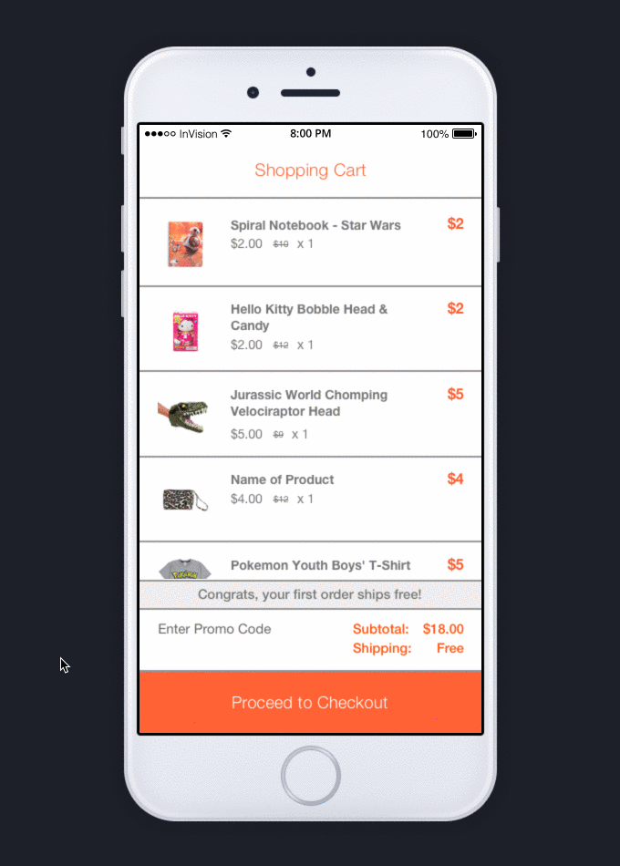
Some Final Designs
After revising based on our user test results and further collaboration with the app development team, we were able to “put a coat of paint” on it, so to speak, and make it pretty using Sketch. This was actually the easiest phase of all since all of the ground work was done ahead of time. The result is an easier to use checkout process with fewer screens, and a lower cart abandon rate on our app. Success! 🙌

Some of the key screens from Hollar’s new iOS checkout.